Pages
▼
Wednesday, April 30, 2008
Kristina's Color Inspiration #7
Here is my creation for Kristina's 7th color inspiration. I wanted it to be easy and simple because I just had a rotten evening! I won't bore you with the details of my evening (plus it's embarrassing!). How about if I give you the details about the card instead!
My card is a little 3x3 cutie on Close to Cocoa card stock. I used a piece of Very Vanilla card stock and stamped a leaf image from Carte Postale in Chocolate Chip. I mounted that on a slightly wider piece of Chocolate Chip card stock. I scalloped one edge of a piece of Soft Sky card stock and mounted the Vanilla and Chocolate piece on top. I used Chocolate Chip ink to stamp the sentiment "delight in the ordinary" from Wordsworth. Finally, I tied a thin vanilla colored ribbon around the bottom of the card. I don't remember where the ribbon came from as it was just stuffed in the bottom of my ribbon drawer. (See, another shameful admission).
Kristina selected this bedding from Restoration Hardware as inspiration this week. She chose bedding again, isn't that interesting? One more bedding choice makes a pattern, if you ask me. Anyway, the colors correspond to Stampin' Up!'s Chocolate Chip, Close to Cocoa, Soft Sky and Very Vanilla.
All of the products and images used in MY card are Stampin' Up!, unless otherwise noted.
Thursday, April 24, 2008
Kristina's Color Inspiration #6
Here is my card for Kristina Werner's 6th color inspiration. I think my card turned out so simple that you would never guess that I struggled and struggled to finish it. I like it (sigh), but I am still frustrated with the whole process. It seems that I made every mistake humanly possible. I smeared ink, I cut cardstock too short and then I just couldn't get the images right! Maybe I will feel differently after some time.
For my card, I used a Sahara Sand base. I stamped the bamboo image from Artfully Asian (trust me, it's there) with So Saffron Ink on So Saffron Cardstock. I then place a strip of self-adhesive pumpkin colored twill tape over the border of the So Saffron and Sahara Sand. I stamped the flower image from Embrace Life in Stazon Black on Very Vanilla. I then used a blend pen to color the flowers in with Pumpkin Pie ink. I colored the stem and tiny leaves with a blender pen and Wild Wasabi ink. Finally, I used Really Rust (don't tell) for the accents on the flowers. I layered this flower image on Wild Wasabi cardstock and mounted it on the card base with Stampin' Dimensionals. The last thing I did was stamp the sentiment from Artfully Asian in Black Stazon on the Sahara Sand base.
Here is the source of this week's inspiration and the corresponding Stampin' Up! colors. In order, the colors are So Saffron, Sahara Sand, Pumpkin Pie and Wild Wasabi. This beautiful bedding comes from Mystic Valley Traders.
Sunday, April 20, 2008
Weekend Sketch Challenge
I have been reading Beate's Blog for some time now and finally decided to participate in a challenge. This is my entry for this weekend's sketch challenge. It was fun and helped to build my desire for new and exciting designer paper. I think my card turned out nice. Let me know what you think!
I used Very Vanilla as a base. Then, on top, I layered Old Olive. The rectangles are Provo Craft Soft Serenity and River Rock. On the River Rock rectangles, I stamped Itty Bitty Backgrounds in River Rock ink. I used a sentiment from Full of Life in both Old Olive and River Rock ink and then the leaf image from Infinite Goodness in Old Olive. I colored in the leaf with River Rock ink and a blender pen. I layered this on top of Old Olive. Then I used Dimensionals to lift it up. I used River Rock Double Stitched Ribbon to run the width of the card under the sentiment. Oh and I distressed the edges of the Old Olive cardstock with the blades of my scissors.
Here is the sketch that Beate provided:
and a link to her blog can be seen in the image. Thanks for looking!
29 More Days
If you ask me, she's already there. I had a discussion with another mother last Thursday and she said if their 2's are not bad, then look out for the 3's. According to her truth, 3 will be just fine for our family.
What I know from my days as a therapist is that if their toddler days are horrid, then the teen years are smooth sailing. I don't gamble as a rule and not preparing for the teens is too huge a risk to take. So I will begin building my raft now for the stormy seas of adolescence.
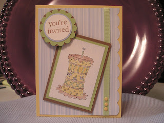
Anyway, a few days ago, I posted a card that was my sketch for her birthday invite as part of a color inspiration. I swapped out the colors for something a little more girly, but did include a green so Daddy wouldn't freak out! Here it is:
I used Pretty Princess and All Year Cheer II to stamp the images. The base of the card is Blush Blossom. On top of that is Spring Flowers DSP (edge scalloped with a corner rounder), Mellow Moss, Groovy Guava and Very Vanilla. The tan paper is something random I had in a drawer. I stamped the cake in Black Stazon and adjusted the top of the cake to hold two candles. I then used my blender pen to color in the cake image with Blush Blossom, Groovy Guava, Mellow Moss and River Rock. Finally, I sponged Groovy Guava around the edge of the cake layer. The ribbon on the card is American Crafts Elements Uptown Khaki. The brads on the card are Making Memories pastel mini circles. Both the cake image and the "you're invited" sentiment are popped up on Dimensionals. (All products are Stampin'Up! unless otherwise listed.)
Wednesday, April 16, 2008
Kristina's Color Challenge #5
Here is my take on Kristina Werner's Color Challenge for 04/15/08. Sweet Pea's birthday is quickly approaching and I had been working on a sketch for her birthday invites. Kristina just chose the colors!
In addition to all of the Stampin' Up! ink and paper colors listed below, I used: Pretty Princess, All Year Cheer II, Whisper White cardstock, Petal Patch DP, Scallop Punch, 1 3/8" Circle Punch, 1 1/4" Circle Punch, Corner Rounder Punch, Stamping Sponge, Blender Pen, Paper Piercing Tool, Soft Subtle Brads, Stampin' Dimensionals and Certainly Celery 1/4" Grosgrain Ribbon.
Here is the image that Kristina chose for this week's color inspiration!
The Stampin' Up! colors represented are Certainly Celery, So Saffron, Bashful Blue and Close to Cocoa.
Tuesday, April 15, 2008
Finding Sweet Pea
I was visiting some of the sites that I regularly view when I ran across this one: http://mistylynnwhat.blogspot.com . I was immediately drawn to the "sweet pea" card. Hmmm, I wonder why? Take a look for yourself and you decide. I think that I might do a regular search and post fun "sweet pea" creations here.
Tuesday, April 8, 2008
Kristina Werner Color Challenge #4
I find Kristina Werner to be quite an inspiration. I accepted her invitation to complete a color challenge and here is my attempt. Her image reminded me of some of the tropical trips I have been on!
For this card, I used a base cardstock of Close to Cocoa. On top of that I layered Taken with Teal, Chocolate Chip and finally a watercolor paper. I stamped the palm tree image from Balmy Breezes (Retired) in Staz On black. Then I used my Aquapainter to watercolor the palm tree image in Old Olive, Chocolate Chip, Close to Cocoa, Tempting Turquoise and Taken with Teal. I finished the palm tree image with a sentiment from the Sale-A-Bration rub ons in Old Olive.
It is hard to see in this photo, but I lifted the Chocolate Chip matted piece off the base card with Stampin' Dimensionals. Finally, I finished the piece by tying a piece of sheer Ivory ribbon around the front flap of the card. I secured the knot with a mini glue dot.
Here are the colors and the inspiration photo from Kristina's website. You can see her website at http://www.kwernerdesign.com/blog/index.html.