Pages

Saturday, May 31, 2008

Packin' Up!

Just kidding! This card is for the Ways to Use it Challenge from Thursday on Splitcoast. With a focus on summer and vacation, the challenge was to use packing products or to use a vacation theme on a card. I used packing tape and tried a new-to-me technique called tape transfer. I recently saw a video tutorial by Shari Carroll of Hero Arts fame!

To begin, I layered my packing tape on my DP (Provo Craft, rob and bob studio) and smoothed it out with my bone folder. Then I stamped my flower image (Daisy style) from Hero Arts Flower Fusion in Black StazOn ink. I had to be careful because of the slippery surface of the tape. After the ink was dry, I cut out my flower images and placed them in a bowl of water. The paper gets wet and fairly easily rolls off with some thumb pressure. Then I dried off the flowers. You can see that I am left with a mostly clear sticker with subtle shading from the dp.

My card base is Kraft card stock. I stamped three stems from Both Ways Blossoms in Old Olive ink. I placed my flower images atop each stem. I stamped the sentiment from Short and Sweet on Whisper White card stock in Chocolate Chip ink. I rounded one end of the card stock with my corner rounder. I cut slightly larger strips of Chocolate Chip, Pixie Pink and Pumpkin Pie card stock and rounded those corners, too. I taped them all down and mounted it on my Kraft card base. Finally, I measured a length of Chocolate Chip grosgrain ribbon, cut a notch in the spine of the card, threaded it through and tied it in a knot. I trimmed the tails of my ribbon and called it good.

Never leave ink pads open!


Isn't that rule number one! Rookie mistake and I paid for it. Of course, I was nearing completion of the card and I dropped the card, face down, on the ink pad. So I dutifully moved by sentiment to cover the largest boo-boo. Let me know if you can tell!

I made this card in conjunction with the challenge issued by No Time to Stamp?. The challenge is to use black and white and one other color. I chose orange. I never use orange so I thought I would try. The idea came to me when I was breaking down the box of Pepperidge Farm goldfish crackers. I went for it!

The base card is Whisper White card stock and I put three score lines down at the base of the card (probably not visible in the photo). On top of that is a layer of Only Orange card stock. Next is a layer of Basic Black card stock and then another layer of Whisper White card stock. I stamped the fish image from Very Punny five times in Black StazOn ink. Then I used my Watercolor Crayon in Only Orange to color in the fish and I moved the color around with a blender pen. I sponged around the edges of the white card stock with a cotton ball and Only Orange ink.

For the sentiment, I stamped "Best Fishes" in Black StazOn and then used my cotton ball to apply the orange ink. I punched out the sentiment with a small oval punch. I punched out a piece of black card stock with a large oval punch. I glued the small oval on top of the large oval and punched holes in each end with my Crop-a-dile. Then I used the Crop-a-dile to secure the orange color eyelets from Making Memories.

I was going to attach the sentiment underneath the image with black ribbon, but , oops, I dropped my card on my open ink pad. So, I moved the sentiment up above and mounted it on Stampin' Dimensionals. Then I took my Only Orange marker and colored a White ribbon from JoAnn's. I tied it around the bottom of the card and secured it with a knot.

All products Stampin' Up! unless otherwise specified.

Always Kristina

Here is my latest interpretation of Kristina Werner's Color Inspiration #10. This was fun! I have been dying to ink up my Always set since I got it. Every time I tried to use it, it just didn't fit until now. I like it! My poor BFF has wanted to borrow it and I just couldn't let it go until I gave it a try. (Ask me now Amy!)

Anyway, here is the inspiration piece that Kristina provided from Pottery Barn. The corresponding SU colors are Old Olive, Bashful Blue, So Saffron, Not Quite Navy and Whisper White.


I used Whisper White card stock for my card base. Then I layered some Bashful Blue on top of that. The next layer is Watercolor Paper. I created a background a la Lisa Spangler. I used my Water Color Crayons (NQN, OO, SS & BB) to draw the stripes and smeared them around with my Aquapainter. Fun and easy!

Then I stamped the bird image from Always in StazOn Black ink. I had to fill in the gaps due to textured paper with a Black Stampin' Write marker. Then I applied the Making Memories Friendship rub-on sentiment. I tied a 1/4" white ribbon from a local craft store (Michael's or JoAnn's) around the watercolor layer and then tied a knot in it. It just didn't look quite finished. So I stamped the same circle flower image from Always two times each in Not Quite Navy, Old Olive and So Saffron ink. I punched out the center with a 1/4" circle punch and then cut out the larger circle with my papersnips. I used two-way glue to stick the circles together. Then, I popped up the circles with Stampin' Dimensionals.

Hope you like it!

All products are Stampin' Up! unless otherwise posted.

Friday, May 30, 2008

Found another Sweet Pea!

I was doing my regular blog surveillance today and found another Sweet Pea! Here it is (click here)!

I hope that you enjoy it as much as I did!

Portmeirion Dusk

Portmeirion Dusk is the name of the pattern of everyday dishes that we use in my household. My husband picked it out when we were registering (good taste, huh!). I have used it as the inspiration for the card I made for SC178.

I started with the focal piece. I used a silver edged vellum square I had just taking up space in my craft room. I can't remember who made it or where I bought it (either JoAnn's or Michael's). I sponged Pale Plum and Perfect Plum ink on the back of the tag. Then I stamped a leaf image from Autumn Leaf Prints in Elegant Eggplant on the tag and then sponged the Eggplant color lightly around the image.

Next, I added a piece of Light Orchid Grosgrain ribbon and a silver brad to cover up the hole in the tag. Then I took a piece of Whisper White card stock and sponged Pretty in Pink, Almost Amethyst and Pale Plum ink over it. Then, I added the "thanks" sentiment from Autumn Leaf Prints in Lavender Lace ink.

Finally, I took Versamark ink and stamped some of the other leaf images from Autumn Leaf Prints for a background.

All products are Stampin' Up! unless otherwise noted.

Tuesday, May 27, 2008

Pretty Challenge

I completed this card for Color Challenge 168 on Splitcoast. The colors for this weeks challenge are Sage Shadow, Chocolate Chip and Very Vanilla. I went to bed last night dreaming of the colors and some of my newly acquired stamp sets. I knew that I would attempt to make this one elegant. I like it!

I started with Very Vanilla card base. I rounded the bottom corners with a corner rounder. I trimmed a piece of Sage Shadow card stock to fit across the bottom and then rounded its corners. I stamped the large flourish from Baroque Motifs two times in Sage Shadow ink and then took my ink pad and rubbed it directly onto the paper edges. Then I layered a piece of the Theater Ribbon Originals across the top of the Sage Shadow cardstock.

Next, I stamped the round flourish from Boho Backgrounds on Very Vanilla card stock in Sage Shadow and Chocolate Chips (two times). I punched the Sage Shadow image image out with a scallop punch and again with a 1" circle punch. I punched the Chocolate Chip image out with a 1 3/8" circle punch and then cut out the small center circle with my paper snips. I sponged Sage Shadow ink on the scallop layer and then edged it with a Chocolate Chip marker a bit. Next, I colored the dots with a Chocolate Chip marker on the 1" circle. Then I layered them up from largest to smallest. I finished that stack with a small Vanilla half back pearl from my Pretties kit. I adhered it with a mini glue dot.

I took my circle image and mounted it on Stampin' Dimensionals. Finally, I used my SAMJ to stamp my sentiment from Hugs & Wishes in Chocolate Chip ink on the Sage Shadow flourish layer.

All products Stampin' Up! unless otherwise posted.

Found a Sweet Pea, Found a Sweet Pea

I found some and I can't wait to participate in this color challenge on Splitcoast!

See them hereand here.

Happy looking!

Monday, May 26, 2008

Stampin' Sunday

Oh wait, it's Monday! It just feels like Sunday with the long weekend. I worked my hiney off Saturday and Sunday in the garden with the hubby to get my day to stamp. I feel a bit productive! As I reflect on what I have ended up with, there seems to be a green theme! I will need to work on changing that up a bit. Anyway, here is what I have to share:


This is for the Splitcoast Challenge Featured Stamper 67. The featured stamper is Dawn McVey and I cased this card http://www.splitcoaststampers.com/gallery/photo/647132?cat=500&ppuser=61311.

I used River Rock card stock for a base. Then I sponged River rock ink on the Pretty in Pink card stock layer. I also sponged River Rock on the Certainly Celery card stock and then layered it on top of the pink. Next, I punched 1 3/8" squares from Very Vanilla and 1 1/4" squares from Provo Craft Soft Serenity dp. I mounted the smaller squares on top of the larger squares and used my Crop-a-dile to punch 1/8" holes and then put in the mellow moss soft subtle eyelets. I mounted the finished squares on top of the celery card stock. Finally, I stamped a sentiment from Much Appreciated in River Rock ink on the card base.

Next up is what I call DH Color Challenge 1. My mother-in-law's birthday is tomorrow and I volunteered to make a card for us to give to her. I asked my DH is he had anything special that he would like for me to do. I didn't know what I would get. His response, "Can you make it purple and green?". Thus DHCC01 is born and requires purple and green on the card. I felt like that left me wide open. He later added, "Pastels are nice".

So, I used Perfect Plum card stock as my card base. I layered Certainly Celery card stock on top of that. Then I layered some Pale Plum card stock next. I distressed the edges of the celery and pale plum card stock only slightly. The next layer is Whisper White card stock. I used Certainly Celery ink to stamp the French Script background. Then I stamped the flower image from Petal Prints in Versamark ink. I used a cotton swab to apply Perfect Plum, Old Olive and Garden Green pastels to the Versamark image. Finally, I sponged the edges of the White card stock with Perfect Plum ink.

To finish the card, I wrapped an olive colored ribbon I purchased at JoAnn's. I then stamped the sentiment from All Night Media's Anna Griffin sentiments in Perfect Plum ink. Then, I placed two mini pastel brads from Making Memories through the ribbon and the top three layers.

Oops, I had better hurry! Sweet Pea is shouting "I want up!" Sweet Pea and the computer do not mix. My final card is for the Splitcoast Challenge TLC170 and it is Sweet Pea's birthday card for her Grandma. It is titled Pick Three. I chose TLC05, SC11 and CC1. I thought it would be really tough, but most of it was already done for me!

The card base is Gable Green card stock. I stamped the round circle images with Versamark ink on the base, with the one circle heart image. The heart didn't show well initially, so I traced the inside of the heart with my Versamark pen. Much better. I stamped the sentiment from Wild About You in Gable Green ink. The next layer is Whisper White card stock. Just to mix it up a little, I scalloped one edge with my corner rounder and then paper pierced the other three edges with the help of my mat pack. I then punched three 1 3/8" circles from Green Galore card stock. Then I inked up the alligator image from Wild About You with Gable Green ink. I stamped off once and then thumped my Green Galore marker across the top of the alligators mouth and back. I huffed and stamped it on Whisper White card stock. I then punched it out with my 1 1/4" circle punch. I repeated the same process twice more. I then mounted my alligators on the white layer with Stampin' Dimensionals.

Thanks for looking! I hope you enjoyed my Monday as much as I did! All products are Stampin' Up! unless otherwise posted.

Edit: I originally posted that I used SC05 as the sketch for TLC170. What a goof! I was soooo distracted by Sweet Pea that I got that wrong. I wonder what else I got wrong???

Monday, May 19, 2008

Happy Birthday Sweet Pea!

When was the last time that you made dinner for 21? I don't know about you, but I never do this. Okay, we had 24 over for BBQ on Sweet Pea's first birthday (but my DH was in charge of cooking the food that time) My DH said "Never again" and I agreed with him.

So this year, I thought I would just have a little family birthday party for her. Family birthday parties from my childhood consisted of my parents, my sister, my maternal grandparents and sometimes my paternal grandmother. So a family birthday party sounded just right for my baby girl! Oops, I forgot to take into account that both of my parents are only children. While I have a sister and my DH has two sisters and two brothers. I guess that is how you get to cook birthday dinner for 21!

Good news, Bad news! Bad news first - there was nada, zero, zilch for left overs. So I had to make something to eat later. Good news - the weather was wonderful, everyone got enough to eat and drink, people had a good time (I think) and Sweet Pea received some really nice (and generous) gifts. I have a VERY lucky little girl.

Check back soon to see the thank you card Sweet Pea will send to all her family members for the nice gifts she received.

Wednesday, May 14, 2008

Cupcakes for Sweet Pea


Sweet Pea will be "2" in five days! So.....she and Kristina and a pair of pajamas are the inspiration for this card. Inspiration can be wacky! Kristina Werner brings the color choices for the card with her Color Inspiration #9. The fact that Sweet Pea is having her birthday necessitates a "birthday" card. Finally, Sweet Pea's friend, Ryan, has graciously gifted her with hand-me-down jammies with cupcakes all over them and this inspired the design. I am not sure that this will be the birthday card that she receives from us, but it might be. That will depend on how the rest of the party prep goes. It is impossible to have a small family birthday party in our house. I think we are having 19 for a late lunch on Sunday.

I won't bore you with my woes. Instead, I will get on with the details of the color inspiration. Below you see the image that Kristina Werner pulled colors from this week.
They are Real Red, Pumpkin Pie, So Saffron, Old Olive and Tempting Turquoise. I felt like the majority of the inspiration piece was in the turquoise and saffron so I tried to use those colors on my larger pieces.

I started with a card base in Tempting Turquoise card stock. On top of that I layered a piece of Real Red DSP. I tied a random white ribbon from Michael's? around the bottom of the DSP, knotted it and used an Old Olive rub on from Love and Happiness (SAB) rub ons. Above that I layered a piece of So Saffron card stock. I punched 1 3/8" circles from Real Red, Tempting Turquoise, and Pumpkin Pie card stock. Next I stamped the cupcake image in Real Red, Tempting Turquoise, and Pumpkin Pie ink on Whisper White card stock. I punched them out with the 1 1/4" circle punch. Then I used those same three colors to make the sprinkles on the cupcake and the inside dotted circle on the Whisper White circles. I used the three colors in all three cupcakes. I'm not sure how to explain this clearly (I think that is why one says, a picture is worth a thousand words). Finally I mounted the cupcake circles on Stampin' Dimensionals to give it some lift!

All products are Stampin' Up! unless otherwise noted.

Tuesday, May 13, 2008

Frangipani Wishes


Have you ever smelled a frangipani? They smell so sweet. I think that there is a different name that is used for the same flower in the West. I was first introduced to Frangipani in Fiji, on my honeymoon. They are a beautiful flower that I have seen in about three different color combinations. When my husband and I were in Thailand, we saw (and smelled) them again. He would carry one around all day just to sniff it periodically.

Frangipani are delicate flowers so I went with delicate colors for the card. First, I stamped the image (from Toybox) in Versamark on Watercolor Paper (oh yeah, I did this for the SCS TLC168!). Then I heated up Silver Tinsel EP with my heat tool. Next, I used my Aquapainter to watercolor with my Yoyo Yellow and Pixie Pink watercolor crayons. I dressed up the flowers just a little more with Icons Rhinestones and then mounted the whole thing on a piece of Pretty in Pink card stock. Then I tied two ribbons (7'8" Ivory Organdy and 3/8" Light Pink Organdy around the left end of the image. I mounted that piece on the Very Vanilla card base. Then I stamped "Warm Wishes" from Hugs and Wishes with Pretty in Pink ink. Finally, I used my corner rounder to round out corners and soften the look a bit more.

Monday, May 12, 2008

Bye-Bye Fingernails! & FS66

I broke two nails on Sunday while doing chores :( That's okay because I was able to do the paper piecing today with relative ease. You are looking at my ode to Jennifer a.k.a. lovetostamp6. I think my favorite part of the card is how she worked in the ribbon on the side. Very cute!

Here are the ingredients for my card. Paper : Barely Banana , Pretty in Pink, Pixie Pink, Whisper White card stock and striped designer paper from DCWV The Stack III. Ink: StazOn Black. Stamps: Merci and Birthday Whimsy. Ribbon: Random red grosgrain in my ribbon drawer (probably from Michaels), Light Pink organdy ribbon and Scrap Essentials Neutrals self adhesive twill tape. Tools: SAMJ, Paper snips, corner rounder, Glue Dots and Stampin' Dimensionals. (All products are Stampin' Up! unless otherwise noted).

Jennifer a.k.a. is the featured stamper on SCS from yesterday. Her creation can be seen below or at http://splitcoaststampers.com/gallery/photo/895811?cat=500&ppuser=68112. Her cards are very sweet and delicate. I tried to imitate that when I made my version. I did follow the rules and changed 2 or more elements of the original card. However, it still looks pretty similar to me.

Saturday, May 10, 2008

Mother's Day

Happy Mother's Day (a little bit early) for all of you Mom's!

I found some time to do Beate's Weekend Sketch Challenge #47. I knew that I wanted to make my mother a really nice card and not just choose something from my card basket at the last minute. Not that I have asked her lately, but I think that my mother likes rich colors, especially deep reds and burgundys. So I focused on using burgundy in my card and it all came together after that. Here is the sketch that Beate provided this weekend:


Here is my mother's card for this Mother's Day. She doesn't know about my blog, so I won't ruin her surprise. Here are the details.

I used Chocolate Chip card stock for the base. I cut a smaller piece of Bravo Burgundy card stock for the second layer. The third layer is two smaller pieces of Recollections DSP (retired). I tied a piece of Mellow Moss taffeta ribbon around the third layer and secured my knot with a mini glue dot. I inked up the flower image from Live Your Dream with Bravo Burgundy, Chocolate Chip and Mellow Moss. I stamped off twice and then stamped onto a piece of Very Vanilla card stock. I used my SAMJ to center the sentiment from All Year Cheer II (retired) over the flower image. Finally, I sponged Chocolate Chip and Bravo Burgundy ink over the whole thing.

Now, I don't currently own any oval punches or Nestabilities. I had to resort to outdated methods and I used an oval stencil to cut out the stamped image. I used a slightly larger stencil to cut out the Mellow Moss oval. Then I distressed the edges of the ovals (to disguise my less than perfect job with the paper snips) and adhered the Very Vanilla to the Mellow Moss. I raised the ovals up on Stampin' Dimensionals and mounted it over the taffeta ribbon. Voila!

Friday, May 9, 2008

Fingernails

Fingernails...are pretty. They prohibit speed and accuracy when typing. Fingernails make it difficult to pick up small pieces of paper when you are crafting. Threading a needle...forget it!

The Pea is asleep so I didn't trim my nails, I went straight to my craft room. No guilt as the hubby is out on the property with two buddies, tasty adult beverages and a bonfire. I was ready to try my first Limited Supplies Challenge and here it is:
I think it was just a long week at school because I couldn't decide what to use. I looked at buttons, stickers, packaged embellishments, designer paper and punches. Finally I settled in on starting with some scrap paper I had laying on my desk. The card base was a reject from Kristina's Color Inspiration #8. I found some other colors that I liked with it and away I went.

I used Stampin' Up! Bashful Blue card stock for my card base. I layered Whisper White card stock on top of it. Then I punched the vase out of Going Gray card stock with a Marvy vase punch. Then I punch out the flowers in Barely Banana, Pixie Pink and Lovely Lilac with a McGill flower punch (this is a poor quality punch from my early days). I colored the center of each flower with a silver gel pen. I positioned my vase and then lifted it back up to punch holes for the stems. I threaded Making Memories Willow Scrapbook Stitches through the holes. Then I tied the Stampin' Up! silver cord around the neck of the vase. I attached my vase and then placed my flowers "in the vase". I used Making Memories Simply Stated Spring rub ons for the "bloom where you are planted" sentiment that I applied to my Stampin' Up! Bashful Blue grosgrain ribbon. I secured the ribbon at the bottom of the layer over the top of the vase. Next, I placed the punched flowers at the end of the sentiment and at the side of the vase. I originally thought I might be done, but then I determined that it still needed something. I whipped out my Stampin' Up! mat pack and my paper piercing tool and paper pierced around the sides and top of the Whisper White card stock. Finally, I was satisfied.

Hope you like!

Thursday, May 8, 2008

Kristina Werner's #8 Color Inspiration

Kristina calls hers an "inspiration" and others in the stamping community call it a challenge. This was a challenge for me. These were not colors that I would normally use together. Of course, this is funny because I was talking to my friend about 45 minutes before the challenge was posted and we both hoped for something to make us stretch. Be careful what you ask for!

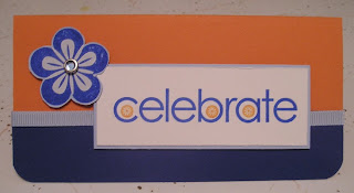
This card measures 3"x6" and the base is Pumpkin Pie card stock. I layered Brilliant Blue card stock along the bottom edge of the card. I rounded the bottom edges with a corner rounder. I then covered my seam with Bashful Blue grosgrain ribbon. I stamped the main sentiment from Celebrate Everything on Whisper White card stock in Brilliant Blue ink. I then stamped the flower circle images from A Beautiful Thing in Pumpkin Pie ink. I layered that on a slightly larger piece of Bashful Blue card stock and raised it off the main card with Stampin' Dimensionals. For my embellishment, I stamped a five petal flower image from A Beautiful Thing in Brilliant Blue on Bashful Blue card stock. I distressed the surface of the flower image and used a White flower imaged from the Eastern Elegance rub ons over the top. I then pierced a hole in the center of my flower and placed an Ice Circle Rhinestone Brad in it. Finally, I cut out the flower image and raised it up off the main card with Stampin' Dimensionals. Here is a closer look at my flower embellishment.


Kristina offered this image up for this week's inspiration piece. She located this gem in Pier 1's room inspiration gallery. The colors that she plucked out the image are Whisper White, Bashful Blue, Pumpkin Pie and Brilliant Blue.


All products used to make my card are Stampin' Up! unless otherwise noted.

Saturday, May 3, 2008

More Paper Therapy

I was asked to make a card for my "roomie" at work. The woman that I share office space with at school needed a card to give to her daughter's doctor. Her sixth grader is recovering from her second foot surgery this year. The poor girl was beginning to have hip and knee pain due to her extremely flat feet. My roomie is grateful for the doctor doing the surgeries and doing them in a timely way so that she didn't have to miss too much work (over Thanksgiving and Spring Break holidays)and so that her daughter could go to camp with her 6th grade class and be in her older sister's wedding this summer.

I used Almost Amethyst as a background and then stamped Itty Bitty Backgrounds in Amethyst ink. I used the same Amethyst ink to stamp the sentiment from Thankful Thoughts on Very Vanilla. I mounted that on Blush Blossom and then Real Red card stock. I tied a red ribbon from Micheal's around the sentiment image and secured it. I drew in 3 tiny hearts at the bottom and colored them in with Real Red. I stamped a band aid image from the Kathy Davis Collection on Very Vanilla. I sponged over the whole image with Blush Blossom and then colored the hearts Real Red. Next, I cut it out with my Paper Snips (love these!!!)and mounted it up on Stampin' Dimensionals.

All products are Stampin' Up! unless otherwise listed.